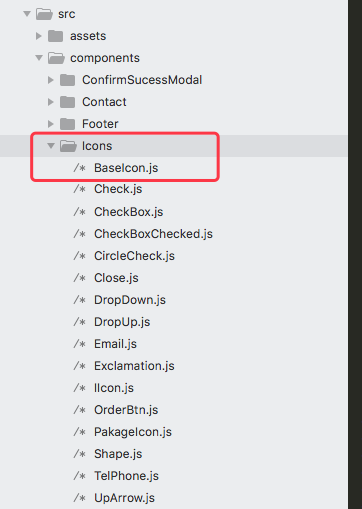
开发前端页面,经常会有很多共用的图标icon,那么我们把它单独做成公共组件,以便后期重复调用!

首先在components 的icons文件夹下创建BaseIcon.js文件。
我们需要先在命令行安装glamorous 和 prop-types
npm install glamorous 或者 yarn add glamorous
prop-types我们就不多做介绍了,glamorous是我们调用svg并改变path的属性时比较重要的插件了。
BaseIcon.js具体内容如下:
1
2
3
4
5
6
7
8
9
10
11
12
13
14
15
16
17
18
19
20
21
22
23
24
25
26
27
28
29
30
31
32
33
34
35
36
37
38
39
40
41
| import React from 'react';
import PropTypes from 'prop-types';
import glamorous from 'glamorous';
class BaseIcon extends React.PureComponent {<br>
static propTypes = {
SvgIcon: PropTypes.func.isRequired,
color: PropTypes.string,
circleColor: PropTypes.string,
fontSize: PropTypes.string,
};
static defaultProps = {
color: '',
circleColor: '#76829E',
};
render() {
const {
color, SvgIcon, circleColor, fontSize,
} = this.props;
if (color === '' && circleColor === '') {
return (<SvgIcon {...this.props} />);
}
const WrappedSvgIcon = glamorous(SvgIcon)({
'> path': {
fill: color,
width: fontSize, //设置fontSize来改变svg的大小
height: fontSize, //设置fontSize来改变svg的大小
},
'> circle': {
fill: circleColor, //设置带圆背景的icon 圆的颜色,下面会给您截图介绍
},
});
return (<WrappedSvgIcon {...this.props} />);
}
}
export default BaseIcon;
|
区分一下单色icon 和 带圆的多色icon,图下:

序号1中,带圆底色的心形icon 为多色icon,需要传两个颜色。 序号2中 为单色icon ,只需要传一个颜色就可以
新建单色icon的js文件 如Check.js 跟BaseIcon.js并列(只用color来控制颜色的)注意:我们的svg icon都是20*20大小
1
2
3
4
5
6
7
8
9
10
11
12
13
14
15
16
17
| import React from 'react';
import { Svg, Path } from 'glamorous';
import BaseIcon from './BaseIcon';
const BaseSvg = props => (
<Svg width="1em" height="1em" viewBox="0 0 20 20" {...props}>
<Path fillRule="evenodd" d="M7.288 14.022L3.34 10.074 2 11.414l5.288 5.288L18.65 5.34 17.31 4z" />
</Svg>
);
export default props => (
<BaseIcon
{...props}
SvgIcon={BaseSvg}
/>
);
|
添加其他单色icon时 只需要 覆盖fillRule 和 d中的内容 就可以了!
带圆多色icon js文件(同样很BaseIcon.js并列就可以)如下:
1
2
3
4
5
6
7
8
9
10
11
12
13
14
15
16
17
18
| import React from 'react';
import { Svg, Path, Circle } from 'glamorous';
import BaseIcon from './BaseIcon';
const BaseSvg = props => (
<Svg width="1em" height="1em" viewBox="0 0 20 20" {...props}>
<Circle cx="9" cy="9" r="9" />
<Path fillRule="evenodd" d="M9.1 6.283c-.61-1.156-1.787-1.668-3.133-1.43-1.814.32-2.676 2.276-1.855 4.158.928 2.127 3.047 3.63 4.988 4.777 1.94-1.148 4.06-2.65 4.988-4.777.821-1.882-.04-3.837-1.855-4.158-1.346-.238-2.523.274-3.133 1.43z" />
</Svg>
);
export default props => (
<BaseIcon
{...props}
SvgIcon={BaseSvg}
/>
);
|
新增的Circle属性 就是背景圆。
icon js文件创建好后,关于icon组件的调用:
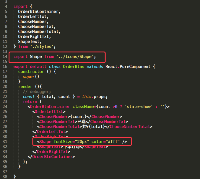
单色组件调用如下图:
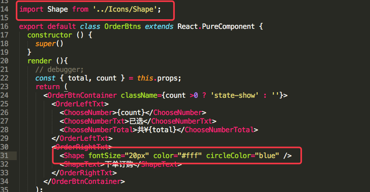
多色圆icon组件调用:(调用方法都一样,只不过比单色icon多了一个circleColor属性来控制圆的颜色)
这样 , 公共icon组件就完成了,纯属个人见解,希望对您有帮助…
---- 感谢观看 :thank you: ----